Creative Director | Director
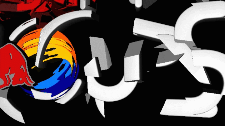
Where The Trail Ends? Red Bull and FREERIDE logo
Where The Trail Ends? Is an extreme sports documentary following professional freeride mountain bikers as they explore remote natural landscapes to take on some of the globe's toughest untouched bike trails.
Objective
For the Red Bull logo I wanted to create a vacuum effect. I wanted the Red Bull logo to feel like it was a satellite pulling in information and transmitting a signal. The signal it is transmitting is the FREERIDE logo and the embodiment of the rocks and terrain the FREERIDE bikes ride on setting the tone for the movie ahead.
Development
I started with sketching different ideas and when I found a concept I liked, I created storyboards using Cinema 4D, and photoshop. I tried not to develop the scene too much because I didn’t want to get married to an idea this early in the process. I focused on the initial material and framing of the logo. To understand the spatiality of the logo I gave it a clean environment and some ambient occlusion for depth.

Initial RedBull logo build concept storyboards.
After creating storyboards, I started exploring the animation and textures for the logos. I kept the textures really plain with simple geometry so I could focus on the animation. Once the animation was in a good place I started to shape the lighting and texturing and adding ambient particles and effects.
Animation test for timing.

Freeride logo treatment.